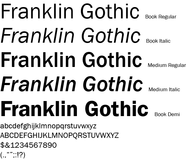
Font For Thought: Franklin Gothic
The Franklin Gothic Family was originally designed by Morris Fuller Benton in 1902. Gothic, a term referring to sans-serif typefaces, probably derived from the architectural definition, which is neither Greek or Roman.
Franklin Gothic is an extra-bold sans-serif type which can be distinguished from other sans serif typefaces, as it has a more traditional double-story g and a. It draws upon earlier, nineteenth century models, from many of the twenty-three foundries consolidated into American Type Founders in 1892. Historian Alexander Lawson speculated that Franklin Gothic was influenced by Berthold’s Akizdenz-Grotesk types but offered no evidence to support this theory[1] which was later presented as fact by Philip Meggs and Rob Carter. It was named in honor of a prolific American printer, Benjamin Franklin. The faces were issued over a period of ten years, all of which were designed by Benton and issued by American Type Founders.

(Sources: Wikipedia and confirmed using other sources. Lupton, Meggs, etc.)
